Monday, January 30, 2012

this is similar to my design based on the field of sunflowers. they are in rows and this color.
this photo is similar to my design of the birds because the lines are diagonal like my design and they have black marks on the lines. 

Monday, January 23, 2012

45) Illusion of Multiple Image

In the illusion of multiple image, there is a figure overlapping another one to create the illusion that there are multiple images present. In this thomas eakins photo, there is success because the images look like there are multiple ones.

44) Illusion of Motion by Blurred Outline

When objects move through our vision quickly, it suggests movement. Here in this gerard richer design, since the outline is blurred, we get an illusion of motion. Without the blurred effect, the photo would look still.

43) Anticipated Motion by Repeated Figure

A repeated figure in a design suggests motion. In this design, the man i repeated and it gives the illusion of motion. Without a repeption of the same figure, the illusion would not have been achieved.

42) Spatial Puzzles (Equivocal Space)

This photo has transparency when the figures overlap. The sense of space is equivocal, and it sort of represents depth as well.

41) Multiple Perspective

In perspective drawing, the vertical edges stay vertical. In this design, that is true. This technique suggests great height, like looking up at a tall building. This design is considered multipoint perspective. All of the designs have a common horizon line.

40) Amplified Perspective

39) Illusion of Space by Linear Perspective

This Edward Ruscha design is a linear of perspective design that creates an illusion of space. The diagonal lines make it seem like there is something more below the photo.

38) Illusion of Space be Aerial Perspective

There is use of value and color in this picture that depicts depth. There is illusion of space by Aerial Perspective in this photo because the value contrast between distant objects gradually lessen and the mountains became less distinct.

37) Illusion of Space by Vertical Location

Illusion of space by vertical location is achieved in this photograph because this format indicates a recession into depth. The artist, Tom Wesselmann, is relying mainly on a vertical location to give us a sense into depth. Without this format, this design would not show vertical location.

36) Illusion of Space by Overlapping


This image shows Overlapping. Due to that, a sense of spacial relationships is established. This design has the same size shapes and outlines but still overlap and make it more interesting to look at.

35) Scale Confusion (intersize relationships as contrasted to Intra-size relationships)

34) Alternating Rhythm

Alternating rythm consists of successive patterns in which the same elements reappear in regular order. In this stokoe piece, there is a reoccuring design with some of the objects. This shows alternating rhythm.

33) Progressive Rhythm

32) Absence of Focal Point

In this Lee Crasner design, there are similar shapes and textures. These are repeated throughout the painting and creates an ambiguous visual environment that is puzzling. Dark and light areas repeat over the surface in an even distribution and no area stands out.

31) Degree of Emphasis (primary, secondary and tertiary Focal Point)

30) Emphasis by Placement

If many elements point toward one item our attention is directed there and a focal point is portrayed. In this painting by Jam Vermeer the flooring and interior designs point us towards the women in the room. Without leading lines, there would be no implied vocal point.

29) Emphasis by Isolation

Emphasis by isolation is a sort of contrast by placement. By being set off by itself, the horses draw attention. The focal point is what stands out and since the horses are darker and off to the side alone, this Thomas Eakins piece works as emphasis by isolation.

28) Emphasis by Contrast (list type of contrast you select)

When a pattern is difficult, it is hard to find a vocal point. If an artist uses contrasting colors, like George Stubbs did in this painting, then it is easier to find the vocal point. The white horse against the dark background contrasts to create emphasis. Had the horse been dark then there would not have been a vocal point.

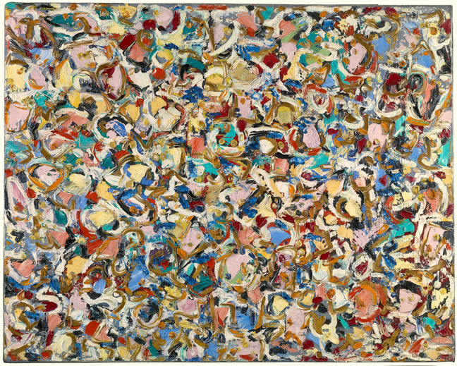
27) Crystallographic Balance (aka all over pattern)

This idea of Crystallographic Balance exhibits an equal emphasis over the whole format which means it is the same weight and eye attraction everywhere. In this Adeline Harris Sears piece, the many blocks are the same size, with each defined in the same degree of contrast to the black background. If one of the blocks happened to be bigger or out of line, this design would not be crystallographic.

26) Radial Balance

All elements of radial balance radiate or circle out from a common central point. A familiar symbol that expresses this idea is the sun. In this Jay Defeo piece, there is a balance coming from a central point and it resembles the sun.

25) Asymmetrical Balance

Asymmetrical balance is the opposite of symmetrical balance. In this case balance is achieved with two objects placed on one side of the photo. This photo by Nan Goldin works because it is not the same on both sides and it weighs more on the left than right.

24) Symmetrical Balance

The simplest type of balance, to recognize and show, is symmetrical balance.
This painting shows it by having the same shapes on either side of the vertical axis. If the shapes were dispersed differently, this would not work as symmetrical balance.

23) Unity with Variety

This pattern is similar to a grid but with a more detailed design. The variety of this design creates a design that is has different shades and lines. The line direction varies and there are shapes within shapes. Some designs can accomplish unity through variety of a more complex pattern, but this simple pattern achieves it well.

22) Unity through Continuity

These two sudoku grids are both made with the same continuing pattern. In relation to each other, they are similar and compliment one another. The horizontal and vertical lines are make a pre-determined pattern that is easy to predict. Unity through Continuity is shown in these two grids because of the vertical and horizontal lines.

21) Unity through Continuation


Balthus' painting uses continuation to convey unity. The rainbow creates a semi circle which leads the viewer's eye to the other side of the painting. The continuation leads the eye to the next element and eventually the entire design will be observed. The characteristics of this painting make Unity through Continuation.

20) Unity through Repetition

In this piece by Taeuber-Arp, Unity is obviously achieved through repetition. The white bar design is used a various number of times. The shape is repeated but the size and minor details change each time. The end result is a composition that is unified but not predicted.

19) Unity through Proximity

In this Thomas Eakins' painting, there is obvious unity. The two men in the middle are very close to each other and proximity is a key factor in this piece making it Unity through Proximity worthy. The characteristics make the painting work together and make a unifying focus.

18) Visual Texture

In this Kurt Kauper painting, Visual Texture is achieved by the satin dress reflecting color from the surroundings. There are areas where the dress is lighter, which suggests different textures and aspects of it. Visual texture is only suggested with our eyes, as is this painting.

17) Tactile Texture (properly describe how image is NOT tactile)


This image by Van Gogh has a texture that cannot be felt. It is not a Tactile Texture, which is a texture of a painting that can be felt as well as seen. Usually it is like a 3-D texture with rigid lines created by using a thick pigment, a technique called impasto. The sky looks rigid and the foreground does as well. Due to these characteristics of this painting, there are no textures but this piece is Tactile.

16) Value as Emphasis

In this work by Winslow Homer, Value of Emphasis is achieved by making the wood a lighter value than the background, which makes it stand out. Additional characteristics include the water in the background with a darker value, which shows depth and leads to a dark, stormy sky. In conclusion, all of those characteristics create Value as Emphasis

15) Value as Pattern

This piece by Giovanni Paolo Pannini uses Value as Pattern in the entire piece. The values are all light with a couple dark spots. This creates a light-filled and warm impression. Without the contrasting lights and darks, this design would not have the same affect as it does. Due to the characteristics of variations of value and tint, this design reaches Value as Pattern.

14) Curvilinear


Will H. Bradley's poster demonstrates an obvious curvilinear design. This design is characterized by continuous curves, which is known as curvilinear. These natural soft, shapes are soft and found in nature. In conclusion, this poster has many curves that seem soft which makes this a curvilinear design. 

13) Rectilinear Shapes

This Rocio Romero's design illustrates rectilinear because the house emphasizes right angles and rectangular planes. In this design all of the forms have straight edges which gives a sharp, angular feeling. THe windows and walls work together and make a design full of right angles that appeal to the eye. Ultimately, the design uses a lot of angles and edges that create Rectilinear Shapes.

12) Nonobjective Shapes

This painting is nonobjective because these forms aren't natural, they're artistically simplified and don't represent anything other than what we see, which is geometric shapes. These pure forms in this Anne Ryan piece of work are nonobjective and have a certain flow in them.

11) Abstraction

This painting by Paul Resika is abstract because the geometric shapes do not suggest a particular familiar object as a whole. Abstraction indicates a basic form of natural shapes to their basic character. In this particular painting, Resika's shapes are in their simplest form and there is very little detail creating abstracting.

10) Idealism

In this photo, Murphy created idealism by correcting all flaws that would be there naturally and making it visually correct. This artistic distortion of idealism is used in the world in advertisements a lot in order to get the attention of the world and convince them to buy a product or vote for them. 

9) Distortion


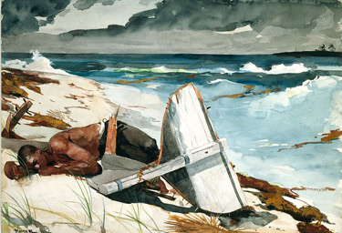
Russel Connor uses distortion in this painting, and it's visible  in the background behind the character. His use of distortion looks similar to what the object would be if it were in its regular dimensions. By using distortion, it could provoke an emotional response or emphasize the design elements from a photo.

8) Naturalism

This painting reveals Naturalism. Russell Connor has provided the visual image, the forms and proportions seen in nature, with an illusion of volume and three-dimensional space.

7) Lost and Found Contour


In this painting, Caravaggio achieved lost and found contour when he emphasized color and value rather than on line. Only parts are revealed by a sharp contour and other edges disappear. Although we do not see lines that create the full shape, we know it's the because the sharp edges assure us shape and mass. 

6) Line as Value

In another one of Rembrandt's drawings, he conquers line as value by enforcing darker, well-defined lines and shape. By doing so, Rembrandt suggests the dimensions to be more than one and with his heavy lines, he creates values and textures.

5) Gesture Line


In this Rembrandt drawing, gesture lines are achieved by not focusing on so much a shape, but emphasizing actions and poses. The darker lines are around the poses of the angel and the man's stance. Our attention is directed towards stance more than shape because the lines are gesturing our attention.

4) Contour Line


In this drawing by Albert Giacometti, he uses many lines to that reach the goal of contour. The lines used
are emphasized in the outline which creates mass and volume. Due to its active lines, we can observe the drawing better and make the shape out to be a young woman. Although there are not many lines, the bold outlines ones create contour lines which direct us towards a concluding shape.

3) Line Character


In this drawing by Ellsworth Kelly, the lines force the picture to be initially perceived as a flower. Although the size and texture is not one of an actual flower, we recognize a flower because Kelly used the value of a line to create shapes that characterize a flower. 

2) Line Direction


In this painting by George Belows, line direction is achieved the diagonal lines that the fighter in the right makes in his leg, as well as both of their arms. The lines lead the viewer's eye to their fists, representing a struggle and a fight. The diagonal lines form a triangle which represents balance and stability. This painting achieved line direction with diagonal lines. 

1) Line as Shape


In this work by Raoul Duffy, line as shape is achieved by creating lines and making objects appear in a certain proximity to one another creating depth and dimension. Additional characteristics include the freely drawn  lines that are loose but descriptive. The way the lines were created make it easy to understand the whole scene. Ultimately, line as shape was created by Duffy by using lines and making them appear as an object. 

Test